- Tuesday 28 July 2015 - Tolkien Calendar 2016: Illustrated by Tove Jansson
- Monday 27 July 2015 - The Amateur Lord of the Rings
- Friday 17 July 2015 - J.R.R. Tolkien a writer of note
- Friday 17 July 2015 - Why tolkien's books are so popular Among the Students
- Thursday 16 July 2015 - The world first publication of a previously unknown work by J.R.R. Tolkien,The Story of Kullervo
- Thursday 11 June 2015 - Rare The History of Middle Earth, all 3 Limited Deluxe Editions in Publishers Slipcase
- Saturday 6 June 2015 - Signed copy of the Hobbit sells for record at auction
- Sunday 3 May 2015 - On the shores of the shoreless sea
- Sunday 19 January 2015 - New Collector Profile added - Giulio Torlai
- Saturday 29 November 2014 - Back to the past - Simon J. Cook on Tolkien and History
- Tuesday 7 October 2014 - Will we ever see The Silmarillion on the big screen?
- SHOW ALL ARTICLES
 Subscribe in a reader
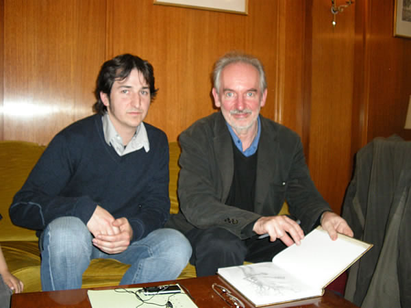
Interview with Tolkien illustrator Alan Lee in Paris, France (20.03.08 by Pieter Collier) - Comments
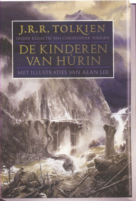
Alan Lee was invited by the French Tolkien publishing company, Christian Bourgois Editeurs, to sign the translation of the French translation of the Children of Hurin at the Paris Book Fair.
I hope this interview will shed some light on the illustrator Alan Lee, his wonderful art, and about his live long association with tolkien's works.
Q: I've just re-read tolkien's essay "On Fairy Stories" and found this passage in the Notes:
The verbal ending … 'And they lived happily ever after' is an artificial device … to be compared to the margins and frames of pictures, … no more to be thought of as the real end of any particular fragment of the Web of Story than the frame is of the visionary scene or the casement of the Outer World. These phrases may be plain or elaborate, simple or extravagant, as artificial and as necessary as frames plain, or carved, or gilded. … It was an irresistible development of modern illustration (so largely photographic) that borders should be abandoned and the 'picture' end only with the paper. This method may be suitable for photographs; but it is altogether inappropriate for the pictures that illustrate or are inspired by fairy-stories. An enchanted forest requires a margin, even an elaborate border. To print it conterminous with the page, like a 'shot' of The Rockies in Picture Post, as if it were indeed a 'snap' of fairyland or a 'sketch by our artist on the spot', is a folly and an abuse.
Then I've taken another look at the illustrations in The Children of Hurin. I knew there was something unusual about them that I couldn't quite define when I first saw them - they don't have borders! Most of the full-page color illustrations I've seen by your hand do have borders on them. So I wonder if you fancied doing something different or whether someone at HarperCollins wanted them borderless?
I originally envisaged the color illustrations as being bordered, either with a simple band of wash, or just placed on the page with a fairly generous margin around them - similar in size to the margin around the type. The idea to go borderless came from Harper Collins; they suggested it as an option for the design of the book, because the book is a little bit smaller.
To go back a little bit, when the Hobbit was being designed, they did a sample page with one or two of the Hobbit pictures bleeding to the edge of a page. At the time I didn’t feel that was quite right and also I actually constructed the border as a part of the artwork, just as a thin sort of filet. I preferred the look of it with a margin, for no other reason than when you bleed something to the edge you are actually physically cutting of a little bit of the painting, because you need to allow that little bit of extra to be cut. And even if it is a tiny amount you still feel that you kind of lost a tiny part of the picture. So I was reluctant about it. But I quit liked the look of it on the page. And there are certain other publications that I have seen where the pictures bleed and it just has a nice look.
So with the Children of Hurin Harper Collins’ editor Chris Smith said this is an option, that we could do this. But he felt that Christopher Tolkien wouldn’t like it. He then asked his opinion and Christopher said ‘no’ and that he was against it. But he’d be happy to look at a couple of versions. So when I had done some of the pictures, I laid them out in two versions and I emailed them to Chris Smith and he passed them on to Christopher Tolkien. And to his surprise Christopher Tolkien actually quit liked the look of it and Chris Smith was very surprised because Christopher was very much against it to begin with. Also, I started to like it more, mainly because you can reproduce a little larger; so you feel you are getting closer to the picture and you are able to enter it more. It allows the image to be seen at a larger size, which is an advantage, considering the modest size of the book and it has a slightly less "fussy" or precious look, which suits the more somber tone of the book. So we all agreed in the end that was the way to go.
I know what JRR Tolkien meant with the reference to a framing device, with fairytales and their illustrations, and many of the illustrations I've done in the past have quite elaborate borders; it can give the opportunity to introduce other story elements or appropriate imagery which would look incongruous within the illustration itself. "The Mabinogion" illustrations that I did 25 years ago used this device extensively in order to hint at the different layers within the stories.
When I sent both treatments of the images mocked up with the text to Harper Collins and Christopher Tolkien, and found, to my surprise, that everyone now preferred the paintings when they completely filled the page. Certainly no one described it as a folly and an abuse.
For me, the edges of a picture are the most important areas. I like to think of the image as a small segment of a much larger scene, so that you feel that, if you could see behind the edges of the "snapshot" there would be something equally, or more, interesting going on. It's a window into another world, but you don't necessarily have to see the window frame. You might even see more clearly without it.
Q: I've read that some people do not consider book illustrations to be art, since they serve a purpose outside of pure creation. Do you consider yourself an artist, an illustrator or more, like J.R.R. Tolkien himself, as a narrator of the tales of Middle-earth, not in words but in images, drawings and paintings?
I think of myself as an… I think of what I do as illustration, because that is what it is. It is always connected with a text or with a story, and is going to be printed. The finished product is the actual printed image on a page. I’m not free to do whatever I like stylistically, since my work is going to be wedded to the words. The responsibility is to help to tell the story, without interfering with the readers’ imagination. In a way it is a bit more akin to a sets designer or to providing music for a film. You are serving the text and you are serving the story. So that’s what I do. I’m an illustrator. But I think you have to be an artist to be able to do that as effectively I can.
Q: If we look at your work for the Children of Hurin, I think we can say you have for sure become an artist.
[laughs] I think in a way you are kind of born to be an artist. I think all children are potential artists.
But I don’t see there is a fundamental difference, the end result is different and the amount of freedom that I have is different. But my passion is for books and for telling stories. So I mean it is a lot closer to the narrative art of the 19th century than it is to 20th century modern art, for example. Illustration is applied art it is art, which is applied to the art of illustration [laughs].
Q: Going back to the choice of not using borders for The Children of Hurin. You mentioned the borderless format suits the more somber tone of the book. I completely agree on that. Your illustrations for Children of Hurin also match better with the more modern English language used in the book. Did this change in tone influence you in any way?
More modern? Every word in the Children of Hurin is actually J.R.R. Tolkien’s. Christopher Tolkien has edited the book but he has not added anything or has not made any alterations to the text. So it is Tolkien’s original choice. But yes, there’s a certain kind of archaic quality to the writing in The Silmarillion. You are right, it does feel that The Children of Hurin feels more… not updated… it is kind of in between the Lord of the Rings and the Silmarillion in its accessibility.
Q: Does this change or influence your style of illustration?
Probably not that much, because it is not so much the style of the writing as the story and the atmosphere that it has created is really resort of the story and the descriptions, rather than the style…
Q. … so you don’t have a first age and a third age style?
no, no,… not in terms of style. If I was trying to create pictures which have an archaic quality, as if they could have been created in the first age, I would really not know where to start with that. I just have to do the painting as well as I can, with my own style, and hope that it is sort of generalized enough, and accessible enough so people can enter into it without really having a style, kind of an interface, between them and the world.
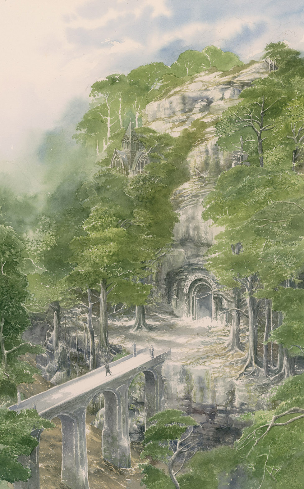
Q: When looking at your art in the Children of Hurin the color plates are most of the time landscapes and the figures are drawn so very small? Was this done on purpose?
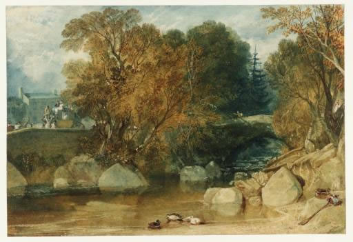
There are two factors. One is that it is a personal preference for me to paint landscapes, because I am more moved and impressed by landscapes. A lot of my favorite painters, like Turner, are landscape artists. And I live in a very inspiring part of England, in Devon, where I see beautiful landscapes all around.
Keeping the figures very small, you are not really committing yourself and committing the readers imagination, to what these characters are; it makes them a little bit more sort of generalized and then the reader can bring more in the job of interpreting of the characters.
It is important not to stand between the reader and the text you have to facilitate the readers’ enjoyment of the text, so you create images that the reader can build on. That is what I like to do.
Q: One would always think that sketches are the unfinished product that will lead to a drawing, to me it seems in the Children of Hurin these are much more detailed then the color drawings. I love this very much it really ads something extra to the story. They are very detailed!
They look detailed, but they were actually done quit large. They have been done on about A2 size. So the detail gets crisper as they get printed smaller. That has partly to do with my eyesight. It has got a little bit weaker over the years. So now I can get back a little bit from the page and draw larger to get the same effect. But I do like the drawings to feel detailed even if they are not, even if the detail is kind of suggested. I like them to feel that you can really peer into it.
Q: When you illustrated the Lord of the Rings you had to space the illustrations evenly throughout the book, which limited the choice of what you could illustrate. I'd love to know if there were particular scenes from The Children of Hurin that you really wanted to do but had to abandon for some reason?
Well, actually the principle was the same, in that with the original centenary edition of The Lord of the Rings, the pictures could only go in certain places in the text, because of the way the book is bound. The art paper is a different type of paper than the paper it is printed on. So the art paper has to wrap around the signatures; so the art pages can only go in certain places. Which is actually quit useful, because with a book like that if you can choose any scene at all, than actually making that choice becomes quite a big part of the process. And it is quit nice to have a page of text, and there is always something beautiful or interesting or fascinating happening on every page anyway. But it is quit nice to have that little extra challenge to say, right what can I do with this page.
And also it means you don’t feel that you have to concentrate on the big set piece moments in the book, the big sort of dramatic type lines, and that suits me because I like to really concentrate on those areas of the book that the author doesn’t kind of create as a climax. It is almost incidental details, the little things that he mentioned in passing, that you can create, make a convincing representation of that; something that a reader probably wouldn’t even have thought about or wouldn’t even have made an image arise in the readers’ mind. The fact that you have added that amount of color and atmosphere to that small part of the book fades inside of the rest of the story telling.
It is very important for me that the text on the page, right next to the picture, relates to the picture. I hate it when you have a book and you come to a picture and it is referring to something that is several pages further on or ten pages before.
I prefer to make the reading of the book feel as one flow where you have the original text and the picture at the right point. If you added music to a movie, a soundtrack, and the music relates to something that happened a few minutes earlier it would be totally ridiculous.
Q: Before The Children of Hurin was released we saw a dummy cover with, I guess, with Glaurung on it. In the end this cover did not make it and the drawing was not used as an illustration either. What happened with that illustration? I liked it a lot?
But it was decided that having the dragon on the cover was giving slightly the wrong message about the book. It made it feel a bit more like a fantasy and a bit less like a heroic tragic drama, which that book is.
So yes, I did that as a kind of a sample and I think it was send out to a couple of publishers, because they wanted to see something. It was just a mistake that it was put in a publisher’s catalogue.
The final image… there was a lot of discussion with Christopher Tolkien about the subject of the illustrations in the book and the cover and I did a sketch showing Turin on this rocky outcrop with a landscape in the background, which he liked, and then I worked that up as a finished cover.
Q: I read in an interview that you were 17 when you first read Tolkien, and that you were 57 when you finished working on the Lord of the Rings movies. Last year you illustrated The Children of Hurin and it seems you now almost have a life long association with Tolkien’s books. Do you expect this to go on for some time still?
Well, I think it might go on. There might be some other projects but I don’t want it to be an exclusive relationship. I want to be able to do other things.
I think what I want to be able to do is to take my favorite stories, mythologies and cycles of legends from various cultures and create a body of work that is sort of a representation of some of these great epic stories. For example I illustrated the Mabinogion, which is the Welsh cycle of legends, and the retellings of the Iliad and the Odyssey. At the moment I’m working on a retelling of Ovid's Metamorphoses. These are stories you will know because they are some of the most famous Greek Myths, Myths of transformation, like Echo and Narcissus. These are the primary source for a lot of my favorite stories.
There are other things that I would like to work on. I’d like to do something with the Arthurian stories; I have done quit a bit of that with various books. But I’d like to take one of the classic texts, or a retelling, and do something with that. I would also like to something with Norse mythologies.
I see the work that I’m doing with Tolkien as a part of that. It is a great sort of epic cycle that happens to be written in the 20th century rather then in the 15th century or earlier.
Q: In September there will be released a paperback edition of the Lord of the Rings Sketchbook, is there anything new in there?
No, but it will have a different cover. I’m not sure what exactly we will be doing with the cover yet. I think it will have a different size. It would be nice if it gets a little bit larger. For the rest there will not be any differences.
Q. Talking about the Lord of the Rings Sketchbook. When I first saw the Lord of the Rings movies I saw some scenes, which were completely inspired by art of your hand that existed already in the centenary edition of the Lord of the Rings. Then when I looked in the Lord of the Rings sketchbook I was amazed how working on the movies must have really set your imagination on fire. I'm thinking especially about Minas Morgul (on p.124-125), Mordor (on p178-9) and the chapter openers like The Blow Falls, (p154-155) where I can see not only Minas Tirith at the bottom left, but if we follow the road through Osgiliath and on we eventually arrive at a tiny Minas Morgul nestled at the head of the mountain pass. Did working for the movies change your style, your way of working, and your inspiration?
O yes, it must have had a huge effect, but I’m not sure if it made a fundamental change in the images that I had in my mind of what things would look like. But in detail, I’d say yes … because I had drawn Minas Tirith before, but it had all been very generalized. So focusing in on what exactly this architecture would look like right down to every detail, the doorknobs, the statues, and finding out what the architectural style was, it made some subtle changes in my mind. I think I made Minas Tirith look more like a medieval looking structure in the original drawings. For the movies we ended up with a more post-Roman, Byzantine structure. Still, I believe that even if I wouldn’t have been working on the film and had started to draw more detailed I would probably have ended up in the same place in the end.
Q: Your Tolkien related illustration has evolved incredibly over the years. For the Children of Hurin you now even used computer to improve your work. Is this moving up a level?
I wouldn’t say that is moving up a level, it is just for convenience really. I started moving to the world of computers when I was working on the films. In order to design effect shots I was taking stills from the film and then taking out the blue screen and adding what I would imagine would be there.
Coming back from New Zealand, I was able to use computers for designing as well. I put the Lord of the Rings Sketchbook together, and used a computer to layout the pages. I had a friend who did the typography. It was really useful; rather than handing out drawings to a designer to do the layout, I could really integrate the pages and create the effect as close as I wanted it to be. In doing that also, scanning my own artwork, I was able to do enhancements, sometimes to get it closer to the original artwork or add a little contrast. There is one drawing; the painting of Glaurung in the Children of Hurin, with the land of fire, there is quit a bit of Photoshop in it. I think that is the only one where it is pretty obvious. I’d probably do more of that, but I don’t want to get away from painting in watercolors.
With the book I’m doing for the moment, the retelling of Ovid's Metamorphoses, there are big spreads with lot’s of different imaginary happening and it’s easier for me to make separate drawings and then combine them in the computer. So computers can come in very handy.
Q: What is the biggest difference between working for HarperCollins, and especially the Tolkien family, and working for Peter Jackson?
[laughs] … well, the big difference is that working on a film your are helping to enable the film director to make the film he wants to make and that is the whole point of being there; to make it easier for him to bring his vision into being.
The fact that John Howe and I were there was because he liked our artwork and thought it was close to how he wanted to make the movies look like. But it is not really about a self-kind of fulfilling role for me as to being able to do what I want to do. It is all about enabling the film director to get his vision onto the screen. It is doing a lot of sketches and getting his feed back and making adaptations and then more details and at a certain point he would say ‘that is looking great’ and you could just carry on and do all the details without showing him everything. Particularly in the early stages we were having meetings with him every day to show the work that we had done and to get his feedback. So it is a very close collaboration when you are working on a film project. And you are also working with hundreds of other people. Every day there would be a cue of people at my door asking for detailed sketches. It was very busy for very long period.
Q: As everybody knows The Hobbit movie(s) have been announced. Will you be back on board, or has work already started out?
I have not had any contact. I think it is pretty certain to go ahead. There are some questions now … there is another lawsuit. But I don’t know when it is going to happen and we are not quit sure who is going to direct it. But if I’m asked and if I’m free, yes it would be very nice to be involved!
Q: Since my website is mostly addressing Tolkien collectors I’d like to ask some questions related to that subject. I have some things I always wondered about. First of all, what is your edition you use to read Tolkien?
I suppose the most well thumbed edition is my centenary edition of The Lord of the Rings. That is the one that is falling apart. I think it was the original one-volume edition from 1992.
Q: Do you have a Tolkien book collection yourself? What is your favorite edition?
I wouldn’t call it a collection, but I suppose I have got quit a few of the books that I’ve done and some books that I hadn’t anything to with like the ones published by the Folio Society, which are really nice.
Q: When you are asked to sign the deluxe editions, for example the deluxe editions of The Lord of the Rings in 1992, how does this work? Do you get a copy of each?
They sent me the individual pages and I sign and number all of them. Normally I sign them first (and a few extra) and then they sent them to Christopher Tolkien before binding them.
I think of the very limited editions I got one copy of each. Of the Deluxe edition of the Children of Hurin I got a box of these, maybe a dozen and about the same number of the general editions.
Q: How do you like the limited Deluxe edition of the Children of Hurin?
I liked the paper and the black and whites are particularly printed better, so I was very happy with that.
Q: Do all drawings in the Children of Hurin have a name, and what are they?
No, I don’t give titles to them. But I think Chris Smith, the editor, he might have suggested titles for them, but in general I don’t.
Q: Artists like Ted Nasmith do tend to sell of their originals, do you ever intend to sell any of your original Tolkien related illustrations or sketches?
I sold a few in the past, but I basically do not like to sell things, because I find it more useful to be able to keep them for future uses. For example I sold some of the early work that I did and now there is no way that I could ever reproduce it, because either the scans have been lost or they were sold before being scanned. I have sold just a couple of the Lord of the Rings pictures. I wished I had not sold them because there will be day they will need to be rescanned.
Q: You have a domain name reserved for some time now, when can we expect a website of your own to be ready?
I got big plans for my website, but I have not put them into effect yet. It is all time really … because I’m all the time working on books. But I’m looking forward to be able to do that.
Q: At my website I announced that 2008 seems to be the year of Alan Lee, this is because all books that will be published this year by Harper Collins will be illustrated by you. How do you feel about this?
Oh … actually, I hadn’t really thought about that … I suppose there are quit a few. Yes… well it’s nice [laughs].
The memorable thing for me is when I’m working on something. For me that is the year for this or that. It doesn’t really often register with me that strongly the various publishing dates. But it is very nice to hear!
Spread the news about this J.R.R. Tolkien article: